
Project Overview
“Add a new feature and improve existing features to Wandure to foster more successful matches”
Deliverables
iOS App
Wandure
UX Academy
Capstone 2
UX Design Lead
Denise Macalino
Project Context
Wandure is a young startup based in Ottawa, Canada. Originally, Wandure was a travel app that allowed solo travellers to book experiences while abroad with other travellers. Over time however, Wandure realized that their users were actually using the app to connect with people and events in their own cities. For that reason, Wandure transitioned from a travel app to a dating app in 2019. Their biggest USP is that every match = a date. To eliminate the “pen-pal” nature of relationships between matches, Wandure gets matches on dates right away. When you match with someone, you choose a date and budget with your match within a 24 hour window after matching, and Wander plans a surprise date for you both.
By the end of this project, my aim is to 1. Add a new feature that will improve Wandure’s overall success rate, as well as overall new sign-ups, and 2. Improve any existing problems and add any supporting features to further facilitate the matching to meeting journey. Wandure has a great unique selling point and could really revolutionize the online dating world with some thoughtful changes.
Problem Statement
Upon some preliminary secondary research, the biggest glaring issue with online dating was turning a match into a potential partner. Most users are looking for a longterm relationship, and seem to get begrudgingly stuck somewhere between matching and conversing. Thus, I’ve come up with the following problem statements:
How Might We Make the Online Dating World an Exciting Place Again?
Approach: Understanding how singletons looking for relationships get frustrated, and improving upon existing Wandure features (and introducing supporting ones) to make the experience more enjoyable
How Might We Foster Better Connections Between Matches on Wandure?
Approach: Creating a new feature that improves the match success as well as turns matches into more successful dates
Project Vision
“To make dating exciting again. Wandure will get people to do what dating apps are really meant to do - get people on dates!"
Phases
For this project, we will begin by empathizing with our users. In order to give us inspiration on how to move forward with making the dating world exciting again, it is imperative that we know the barriers that exist for those looking for love online.

Project KPI
# of New Sign Ups: Word of Mouth remains the most common way that people are influenced to try new things and products. If we design a truly great experience for dating, then people will find great connections, spread the word, and this should ultimately lead to more sign ups. With the pandemic increasing the activity on dating apps in general, this is a great time for Wandure to step in and prove its place in the online dating market.
% of Match turned Dates: As Wandure’s main USP is getting people on dates, it only makes sense that one of our main KPI’s is not just creating matches, but turning matches into dates. If the percentage of matches that become dates increases, then we know that we are on the right track with our design decisions.
Project Scope
The scope of this project will be user interviews, usability testing, secondary research, competitive analysis, lo-fi, mid-fi, hi-fi wireframing, and prototyping and testing. The end result will be a new feature as well as supporting features for Wandure.
Phase 1 | Empathize
Before even attempting to come up with potential solutions to online dating, the first step is doing extensive research! What pain points do people have when on dating apps and looking for matches? What are the online dating trends and how do they affect our work? As someone who has never used any dating apps or websites, it is both intimidating and exciting to jump into the world of online dating. The methods of research we will conduct are: User Interviews, Competitive Analysis, and Secondary Research.
User Interviews
There were a few common complaints about the experience of finding love online, but there were also some great disparities. I interviewed a total of 7 participants - 3 males, 4 females, who ranged between the ages of 20 - 40, and also ranged greatly in professions. Unfortunately the sample size is mostly heterosexual, so the results will more likely reflect the experiences of straight men and women. The following findings do not give us any clear indication of what dating pain points LGBTQ individuals experience. Here is a full view of my User Interview Findings.
After conducting these user interviews, the 2 main archetypes that stood out within the online dating world were: just-here-for-fun daters, and ready-to-settlers. Most were ready to settle, so that is the archetype that we will be designing for primarily.

Secondary Research
Now that we’ve conducted user interviews, we can start to solidify any hypotheses we have formed through reading and watching studies and articles shedding light on dating apps. The questions we’ll attempt to answer in our research are: What are the current trends in online dating? Who are the main users of the apps? What are the greatest pains for users while using dating apps and sites? How has COVID changed and affected online dating?
Through reading up on the online dating market, it’s clear that the online dating industry is a rapidly evolving space. It is only becoming more and more part and parcel of everyday life in our society. It is no longer something that the minority of people participate in. Rather it is expected that a majority of younger generations (Gen Y and soon most of Gen Z) will have participated in online dating. Here are the most important insights from our secondary research:

Click here for a full view of the secondary research insights
Competitive Analysis
It was pretty clear from speaking to users and from reading up on the industry that Tinder, Bumble, and Hinge are overwhelmingly the most popular and successful apps. I wanted to learn from the best in the game but also use this as a chance to see any areas of opportunity for Wandure to step in.

Phase 2 | Define
Now that we have some answers to our research questions, we can begin to hypothesize: Who is it that we are designing for? What might they be experiencing? What will our main goals be in our design approach? The first step is to define our user. We can’t possibly come up with potential solutions if we don’t know who is at the centre of our design decisions. The best way to do this is through a user persona.
User Persona
As mentioned above, the target user archetype is the ready-to-settler, as they are the most common demographic based on our research, but also the most likely to be frustrated with the experience of dating online.

Empathy Map
We can see how Michael Hayes is being nudged in certain directions by friends, how he goes from hopefulness to hopelessness, and why. We see that because he’s on dating apps at all, he is certainly someone who takes initiative, but also someone who doesn’t do so without being incentivized. We find out that he loves company in the form of new people and is open minded, but also needs some guidance. Understanding him on this level will allow us to make design decisions empathetically. If Michael is open minded, then can we introduce a feature that allows him to express or dig into this? If he needs incentive, how does the way Wandure work currently prevent him from getting on dates?

User Journey
This user journey outlines the following four stages users take on dating apps: Swiping/Liking, Matching, Messaging, and Dating. We then fleshed out the goals, actions, thoughts, and emotions at each stage, as well as touchpoint (where are these stages taking place online and offline?). This user journey in conjunction with our user interviews and secondary research from before, confirms that the area on which we need to put our focus is between messaging and meeting? We now have a question to address: How can we make the experience from messaging to meeting in person more successful?

Project Goals
Now that we have a clearer idea of where our focus needs to be, we can plot out the goals that we will set out to meet for this project. There are three aspects that we need to consider at this stage: technical, business, and the user. There will be a lot of overlap, but individually as well, each aspect is a stakeholder in our design approach. We need to understand what technical goals need to be met to make Wandure a seamless and functioning app. We have to think about the user on a deep level, and make sure we are meeting their needs to find love. And of course, we have to consider that at the end of the day, this is a business, and our solution needs to ensure that sustainability of this model.
Below is a diagram of these goals:

How Long Does It Take For Strangers To Fall In Love?
After identifying the goals for each aspect, it became clear that the common goal and the one that we should strive for is creating an organic flow from swiping to matching to messaging to dating. After much brainstorming, swiping left and right on competitor’s apps, and analogous inspiration, the main new feature I came up with is integrated conversation prompts. This made the most sense to me because:
1. The biggest pain point was conversations fizzling out, and a potential match going to waste because of a dud of a conversation
2. Prompts are already a popular and successful element of the most-liked dating apps (Hinge and Bumble)
3. A great way to deepen a connection between strangers is simply to ask the right questions.
This idea is also largely inspired by the card game We’re Not Really Strangers and the New York Times’ list of 36 Questions to Fall in Love. Both are essentially a list of questions designed to cut small talk between strangers and prove that you can get to know and get to love just about anyone by asking the right questions. The conversation prompt feature is an approach that will allow users to not only break the ice between matches, but also make the connections meaningful.
Feature Roadmap
Referring back to our Competitive Analysis, we will begin to narrow down the features that we should move forward with. This is an inventory of all the features that we discovered on Tinder, Bumble, and Hinge, as well as what already existed on Wandure. Unlike the competitive analysis however, we want to rank these features based on priority from 1-4.
As you can see below, the feature roadmap we’ve created gives the list of features, what informed our including it in the inventory, and what priority it holds in our scope (P1 to P4 - 1 being “most important" and 4 being “can wait until later”). The P1 features that we chose are 1. What our competitors shared, and 2. What features best addressed our problem statements regarding making the experience enjoyable and increasing match to date ratio.

Feature Matrix
Building on the feature roadmap, I’ve created a feature matrix. This prioritizes the features we’ve identified based on not just impact, but also considers resources. Although the dream would be to include every feature that we believe to be necessary, in the real world, this is just not possible. Therefore, we have divided the features into 4 sections: Low Impact; High Cost, High Impact; High Cost, Low Impact; Low Cost, and High Impact; Low Cost.
Features that fall within High Impact, Low Cost are no-brainers to include. Features that are Low Impact and High Cost are likely to be cut from our list. Features that are Low Impact; Low Cost, and High Impact, High Cost live in the middle and can be considered on an as-needs basis. The must-have features are the ones that are most focused on creating deeper and more meaningful connections between matches.
Any other features that we focus on should facilitate this goal.

Information Architecture (IA)
Especially since Wandure has a lot of moving parts - (now) an integrated conversation prompt feature, and a date planning feature, there are a lot of logistics and steps that could be forgotten or improperly integrated. Great information architecture will allow us to avoid making extreme changes to our system after the wireframing stage.

Phase 3 | Ideate
Only after synthesizing all our research and insights from the first two phases can we begin to ideate on approaches and solutions. To draw out the most important journey a user would take, I’ve taken the sitemap and distilled it down into this task flow. This will make it easier to understand the user’s goals at each point in the journey, and therefore inform us of what direction we can take to best address these goals. We can refer to this to keep some important questions in mind: What might a new user of Wandure feel when setting up their profile? What might they be thinking when matching on profiles? What barriers might exist to keep them from proceeding from chatting to meeting in person?

Initial Changes
There are some changes I’m making right off the bat based on our empathizing phase. Based on Wandure’s current flow, and our understanding of our ready-to-settle persona, I built out some preliminary wireframes on paper. These wireframes include the new chats prompt feature into the flow, while also improving upon the initial issues identified in Wandure’s current UI and flow. First, refer to the immediate changes below on the current design process:

Paper Sketches
With all these major issues out of the way, I could begin initial paper wire framing:

Mid-Fidelity Wireframes
Next, I developed mid-fi wireframes after finalizing the paper sketches. It was important to flesh out the new chat feature on paper before committing to any designs in the mid-fi stage. I also needed to ensure that the biggest glaring issues were addressed before moving to the digital versions.
I took Wandure’s current screens and created each screen of the journey from scratch, while adding any elements that I listed from my changes above. Finally, I added the screens necessary for the conversation prompts feature: a separate “prompts” area, a list of questions with copy explaining how it works, and a confirmation notice.

Phase 4 | Prototype
I believe that it’s essential to conduct user testing early on, which is why I prototyped the mid-fidelity wireframes. Although we made a lot of changes in our paper sketches, we need to test and validate the flow and new feature before implementing UI. It will save us a lot pain to conduct testing at this stage, than to do it all at the end, when we’ve already invested in adding UI elements.
I recruited 3 users to test this prototype. Users ranged from 24 - 32 years of age. 2 testers were female, and 1 was male. 1 was from Seattle, 1 from Montreal, and 1 from Toronto. Based on Wandure’s goals to increase successful matches, and our new feature to improve chat to date rates, I simulated the following 4 tasks: 1. Setting up an account, 2. Editing profile information, 3. Matching and sending a prompt, 4. Planning a date.
Click here to see the full mid-fidelity prototype

Usability Testing Plan
Below you can find a more detailed test plan for my usability testing:

Usability Testing Script

Here you can find the script for my usability testing. Click for full notes on these tests.
Main Takeaways
Prompts | Prompts at sign up can take a while for users to answer. They should be made skippable and done after account set up. However, it will be made necessary to complete them in order to be seen by other users
Edit Profile | All users were confused that they needed to click the pencil icon on the photo to edit profile information. It would make more sense to make the CTA “Edit Profile” or to move the CTA to the section below as “Preferences”
Matching | Users were confused that they couldn’t swipe right immediately. However, when they figured it out, the liked that Wandure forced them to look at the entire profile, which helped them slow down and address mindless swiping. However, there should be a short tutorial screen at arrival of the Matching stage to explain that users need to scroll down
Convo Prompts | All users really loved the conversational prompts feature. They felt they were intriguing and that the feature was well integrated in the existing app
Planning a Date | Payment details should not be asked of users at the planning stage. This is a huge turn off, and all users felt they wouldn’t provide this information. They don’t fully understand what they are paying for and lose trust immediately at this point. A better approach may be to have the date planned on Wandure’s end first, and then ask for payment after users have already set a date and budget.
Mid-fidelity Changes
As I mentioned above, testing at the mid-fi stage was crucial. There were some small issues, such as the profile editing process and the matching, but there were also some big issues in the flow, such as forcing users to answer prompts right away, and asking users to pay before they understood what they were paying for.
After identifying the main issues and potential approaches to address them, I made the changes I deemed most essential:
Complete Prompts Later
Some users felt that they wanted to be able to complete their profile prompts later. After all, it could make or break being matched on - they wanted to put time and effort into it. So, in this new flow, we’ve made the prompts skippable at the sign up stage, but we also made it necessary to complete in order to be seen by others.

2. Matching Tutorial
Because Wandure works differently than its competitors in the way that users match, some users were confused about how to match on other users’ profiles. For that reason, I decided to include a tutorial screen, using icons and images to explain the required gesture on Wandure, which is to scroll all the way down to the bottom of a profile to match.

3. Planning a Date and Payment Changes
Most users felt that they didn’t know what they were paying for when prompted to pay right after setting a date budget and times. There was an immediate decrease in trust when users had to input payment details before knowing when the date was or what it would be. To make the process more empathetic, I decided that it made most sense to have users set their budgets and their times, to wait for a confirmation that their date was planned by Wandure and then be asked to pay. This way, they already have an idea of what they’re paying for and they’ve spent at least a few hours getting excited for a date before committing to a payment.

User Interface Design
Before moving onto applying UI elements, I think it’s always important to create a UI kit to refer back to in that hi-fidelity stage. Below is a UI Kit that reflects Wandure’s brand elements, as well as what certain aspects, from cards, logo, and icons will look and feel like.
Wandure’s UI is already quite good, so we didn’t make any changes here, besides adjusting the font size standards

Hi-Fidelity Designs
After finalizing the UI kit, I could then begin to combine the changes from the mid-fidelity testing with the UI elements. Below you can see a snapshot of the hi-fidelity wireframes. This prototype was created with the significant changes we made at the mid-fidelity level. Here is a full prototype of the first hi-fidelity wireframes.

Phase 5 | Test
In order to verify that our approaches to the problems with the flow, and other areas of frustration we need to test our hi-fidelity prototype. With the prototype above, I conducted usability tests with 4 users to understand any other areas that needed to be reconsidered. For this usability test, I actually added a fifth task. Since I removed the payment process from happening immediately to happening after a date had already been confirmed, I needed to draw the last step out into: planning a date, and paying for a date.
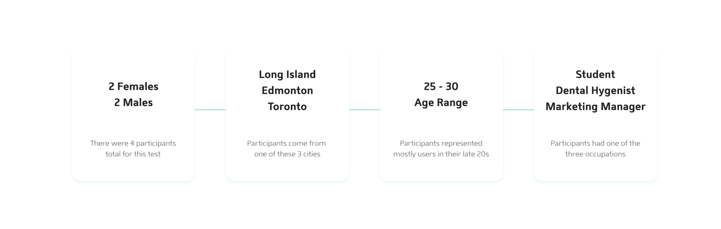
Other than that, the other tasks were the same as the mid-fidelity testing tasks in order to see whether or not the changes that we made make sense. I recruited 4 users to test this prototype. Users ranged from 25 - 30 years of age. 2 testers were female, and 2 were male. 1 was from Long Island, 1 from Edmonton, 2 from Toronto.
Important Insights
After conducting these tests, it was clear that there were some solutions that worked well, but it was also clear that there were some things that still needed reconsidering. I recorded all the important insights and notes from these tests and organized them into an affinity diagram below of my findings. Creating this diagram helped me understand what solutions were successful and can be left for now, and more importantly, helped me see what the biggest pain points were and where I need to focus further changes:

Once I identified these issues, I made the necessary changes to the design below:
Sign Up Changes | All users preferred to sign up via phone number. Users felt that Facebook had too much sensitive information that they wouldn’t want a dating app to have access to. For this reason I referred to Uber Eats’ design pattern for sign up. This design prioritizes the phone number sign up, while still allowing users a way to sign up via social media.
Chat Design | There are a lot of elements in the chat section, especially as that’s where our main focus has been for changes. I referred again to Uber Eats for a different solution for the progress bar. We didn’t want to remove it, just make it more minimal to take up less real estate and reduce potential cognitive overload.
Setting a Date | Users felt that the current set up for choosing a date is quite exclusive and only considerate of people who work 9-5 jobs. All users felt that there should be more customizability, so I reconsidered the date selection process altogether. I referred to Calendly’s date selection process, which allows users to pick a day and respective hours.
Final Version
With the final changes made, we have our final (for now) version! This version includes a sign up process that is less scary and cumbersome, with shorter onboarding, phone number sign-up prioritization, more inclusive language, and skippable areas to decrease the barrier for entry. It has tutorial screens to explain features that users might not be accustomed to moving from competitors like Tinder, Bumble, and Hinge. The chat screen is more minimal and clean than before. Finally, the process for planning and paying for a date is a lot more empathetic to users’ expectations, allowing them to accept a date and then pay. Click for the full prototype

Reflection
Overall, I believe that through testing twice and really empathizing with users’ concerns, I’ve created a flow that really humanizes the online dating experience. This was a really fun project to work on, and it was amazing to see the kinds of ways that empathetic design can make a difference in peoples’ dating lives. It was great to see how well-received the chat prompts feature was, and it was equally rewarding to understand on a deep level what changes needed to be to make going on a date a lot easier.
Next Steps
If I were to continue with this project, the other problem areas I would focus on would be:
How can we make users more excited for potential dates?
It is a big assumption that users would be willing to agree to a date so quickly after meeting someone online
This is an area where we can focus our attention on the actual date-planning stage
Some questions to consider here would be: how can we let users imagine dates before going on them?
Another big question that came up in this round of design was:
How might we keep the surprise of a blind date while also providing enough information to relieve any anxieties around meeting up with a new person?
The question of safety and security (particularly for women on the app) is just as important as keeping the mystery and excitement that intrigues users to get on dates in the first place. An area to focus on should be how to find a balance between the two. Wandure’s greatest area for improvement was building trust with users, as that seemed to be the greatest pain points.
So with this new feature, we have humanized online dating, but now we can consider how to make users feel both safe and excited.