
Project Mission
“Increase library patron engagement by incentivizing patrons to engage with more library blog content”
Deliverables
Updated Landing Page
(Desktop & Mobile)
Company
BiblioCommons (bibliocommons.com)
Duration
3 sprints (over 6 weeks)
Product Designer
Denise Macalino
Product Manager
Natasha Hesch
Engineers
Francisco Canas
Adam Di Pardo
Context
BiblioWeb is a B2B2C company that offers software solutions for its public library clients, including a CMS that allows them to create and manage their own websites.
As part of their websites, many libraries have dedicated library blogs, which increase engagement on their homepages, and lead patrons to related library items (which are promoted within the blog posts).

Title Promotion
Library blogs play a large role in increasing the rate of patrons that place a hold on items (promoted within the blogs), which patrons are otherwise not discovering.
Problem
If patrons are not finding titles they are interested in within the blog post they are reading, the ideal scenario is that they navigate to another blog post which does and continue to engage with content. If they are not doing that, they are getting stuck, frustrated, and abandoning the experience.
39.5% of outbound clicks related to blog content
8.5% of outbound clicks are to one of the titles
The 39.5% is very dispersed and tells us that patrons are not exactly sure where to go to find more interesting content. This could be improved by better guiding users to content they are likely interested in.
Our current experience does not provide users a cohesive path to find content. Based on this data, the next best step would be: users find another blog post that does include related titles that patrons would be interested in.

Breakdown of total clicks on page
Problem Statement
We are not optimizing the traffic that arrives at the blog post landing page and may engage with more content. To provide patrons a better discovery experience and also help the libraries increase the number of holds placed, we need to explore the following:
How Might We increase patron engagement by guiding users seamlessly to content they are interested in?
OKR: Objective & Key Results
Since we know that 39.5% of patrons are interested in reading more blog posts (if they aren’t interested in placing a hold in any of the titles listed), then we can assume that improving the blog discovery experience will increase patron engagement and in the long run, the number of holds placed on items.
Our main objective is to increase patron engagement by guiding users to more relevant blog content. The key result we hope to see from this effort is an increase in blogs viewed per session, an increase in conversion rate for blog cards/links, and in the long run, an increase in the number of total holds placed.

Objective and KPIs
Hypothesis
If we improve the blog landing page to better guide users to related blogs, we will increase the conversion rate of blog cards/links and increase the number of total views per blog post (and eventually increase the rate of total holds placed).
Research
Performance heat map
As one of my goals at BiblioCommons has been to integrate quantitative research (in conjunction with qualitative research), I wanted to spend time analyzing more data. First, it was important to understand user behaviour on our existing blog pages, so I pulled a heat map of a blog post example from one of our clients.

Performance Heat Map
Main Insights:
Some of the main insights from analyzing this heat map are:
There is a surprisingly high interest in the author of the blog post
There’s high interest in “Blogs” via the breadcrumbs
There is some interest in “Categories” and “More Posts” from the sidebar
Data Analysis
The heat map gave us a good idea of where general interest is on the blog landing page. However, I wanted to gather the exact numbers and see:
How many users are clicking through to recommended blogs.

Clicks to blog related content
The click through rate shows confirms that there is interest in recommended blogs as a whole, but most users are still using the breadcrumbs to return to the general blogs page. This is not ideal, as it makes the user do more work on their end to find interesting and relevant content.
Competitive Analysis
Now that we know that patrons do have an interest in seeing more blogs, but that most are still not going to recommended blogs, my hypothesis was that the way we were presenting recommendations is hindering the overall blog click-through rate.
I decided to conduct a competitive analysis to see how other sites and services are getting engagement on their recommended blog links. I wanted to look at sites that create content on a regular basis so I looked at Medium, Vox, CBC, and the Atlantic.

Competitive analysis
My biggest findings from this competitive analysis are that:
most of our competitors have several visual treatments for recommended content, and most treatments include a blog image to draw attention
Promoted content was placed in sidebar the right-hand side (hypothesis: this is where users’ reading pattern normally follows)
The one category of recommended blogs that all the competitors included was Popular Blogs
Cards were very minimal (only two pieces of metadata - title and image, or title and date)
Informed readers why content was being promoted (we just use “more posts”) vs. Similar Posts, More from this author, etc
The pages in general were very minimalistic and easy to scan
Mock-ups
From our research, the main things we needed to consider when beginning to work on the designs were:
Creating components that leveraged imagery
Keeping the cards very minimal
Clarifying why content is being promoted
Updating the UI to feel less outdated
Hero Section
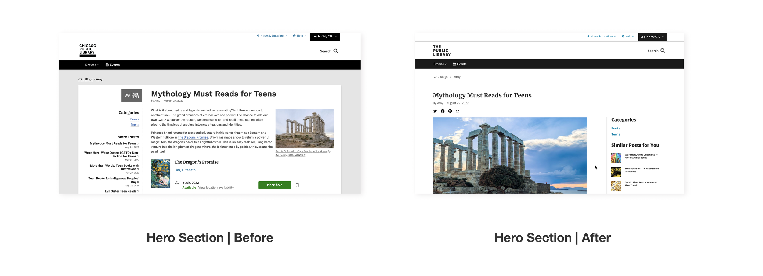
Hero section before and after
Moved sidebar to the right-hand side
All our competitors that included a sidebar kept the sidebar on the right-hand side, rather than the left, like us (this is an outdated pattern)
My hypothesis is that the reason for the sidebar placement on the right is that it better accommodates the typical reading pattern a user will take (from left to right on a page)
Note: on mobile, the sidebar disappears, as it would appear above the blog content and push it down. Based on talks with engineers, it is possible to include it, but doing the UX and engineering effort for it within this project would be out of scope, so we’ve moved exploring that effort to post-MVP
New Card Components

New card components
Including cards with images
Our data showed us that there was an interest in exploring more blogs, but we believe that because the links are just appearing as hyperlinks currently, the promoted blogs are going unnoticed
We also wanted to change the wording from “More Posts” to “Similar Posts” so that it would inform users why they are being recommended content and therefore hopefully feel incentivized to click them
More recommended blogs

Recommended section before and after
Added new section and updated comment box
Although our users are exploring other blog posts after completing one, we are not making the most of our recommendations by only allowing for discovery via the sidebar and author link
I included a section below the blog post that promoted content by the same author and new posts
As we saw that interest in more content by the same author, we prioritized the section titled “More by x author”
To mirror what we saw in our competitive analysis, we also wanted to create greater personalization and title one of the sections “Similar Posts for you” indicating to users that these blogs are being shown to them because they are about a similar topic and are specific to the user’s reading habits
Experiment
At this stage we would normally conduct some user tests. However, because we already have data to suggest that users are indeed interested in seeing more blog content, we decided it made more sense to spend time running design experiments.
We had a feedback call with our stakeholders (the preview libraries that would participate in the beta version of this feature). After those calls, came to the conclusion that it would be more valuable to run some A/B tests on variations of our designs
A/B testing
After our feedback calls, it was clear there was some contention on several aspects of the designs. These aspects were:
Sidebar link treatment
Recommended section placement
Mobile card treatment
Test 1: Sidebar link treatment
Some of our libraries flagged that the tiled card design for the sidebar links made the page feel too busy. Since titles are already promoted throughout the post, having more images takes away too much focus from the blog content itself. The PM and I felt differently, which is why we proposed the first test.
Sidebar links:
Version A: includes tile images with the links
Version B: removes the tile images
Hypothesis: Version A will have higher blog clicks than Version B, because including images will draw greater user attention

Test 1: Sidebar links
Test 2: Recommended Section Placement
Recommended section:
Version A: has the recommended blogs section below the comments
Version B: has the recommended blogs section above the comments
Hypothesis: Version A will have higher blog clicks than Version B, because the user is more likely to see the sections above the comments

Test 2: Recommended blogs section
Test 3: Mobile Card Treatment
Some libraries mentioned that the tiled cards look like advertisements, and may be overlooked by patrons. The PM and I assumed that, on the contrary, the tiled card treatment shows patrons more blogs to choose from, and should therefore increase the total click through rate.
Card treatment:
Version A: uses full sized cards for promoted content
Version B: uses a tiled card
Hypothesis: Version B will have higher blog clicks than Version A, because more recommended content can be shown at once (6 cards vs. 3 cards)

Test 3: Mobile card treatment
A/B Test Plan
In preparation for our A/B test, we needed to determine how long we were going to run the tests for before pulling results.
Calculating sample Size
To calculate our sample size and duration, we took our Minimum Detectable Effect (which is essentially the minimum difference we expect a specific version to have over the other), and added it to our Anticipated Incidence Rate to see how many users we needed in order to reach Statistical Significance.

Since we know that 3% of users currently click to the sidebar links, and we expect Version B to perform the lowest, but still have a Minimum Detectable Effect of at least 5%, and Version A to perform 5% better than that, our Anticipated Incident Rates for Versions A and B respectively are 13% and 8%.
That gives us a sample size of 589 per variation, which means we need to reach 1178 users. Since we know that we reach roughly 400 users per blog per week, then we can expect to run the experiment for 2.9 weeks. For extra measure we will run the experiment for a full month.
Above you can see the calculation for the 3 tests.
A/B Test Results
Test 1: Sidebar links
Variant winner: Version B - only links
To our surprise, Version B, the version without images performed better than Version A
Version A had 4.7 total clicks
Version B had 7.2 total clicks on blog cards
My assumption is that the libraries were correct that the treatment with images alongside the link looked like advertisements, causing patrons to skim over the cards.

Test 2: Recommended blogs placement
Variant winner: Version B - section above comments
As we expected, Version B performed better than Version A
Version A had 4.5 total clicks
Version B had 5.8 total clicks on blog cards
It seems that our hypothesis that having the recommended content live above the comments would increase the chances of patrons seeing and engaging with the links was correct

Test 3: Mobile blog cards
Variant winner: Version A - full-sized cards
Similar to Test 1 results, this test surprised us and showed us that the tiled card approach does not perform as highly as we anticipated
Version A had 17.8 total clicks
Version B had 13.5 total clicks on blog cards
My assumption is that the libraries were correct that the treatment with images alongside the link looked like advertisements, causing patrons to skim over the cards.

Final Version
After confirming the best treatments from the A/B test results, I put together the final designs for our updated blog landing page:
The sidebar on desktop has only hyperlinks
The recommended content below the blog is now above the comments section
Mobile blog cards are full-sized rather than tiled


Objectives & Key Results
In the end, how did we perform regarding the metrics we wanted to track?
While we did A/B testing, our senior engineer also collected general data on the metrics we identified at the start.
Question 1: Views per blog post
Is the promotion of cards on blog posts increasing the number of blogs viewed per session?
Answer: Only slightly. Data shows 1.30 blogs viewed per session for the control vs 1.31 for the variant
Question 2: Overall holds placed
Is the promotion of cards on blog posts increasing the number of holds placed, shelf adds, and bib clicks?
Answer: Yes. Data shows 169 of these events in the control and 192 for the variant
Question 3: Total content clicks
Are the new blog feeds on blog posts increasing content clicks?
Answer: Yes, very much so. Data shows 395 content clicks on blog pages in the control and 621 for the variant
Learnings
Positives
Statistical Significance
Overall, this project was a great chance to look at larger sample sizes than we normally get to, and confirm patterns with greater statistical significance. When we conduct user testing, at most we are testing 10 users, which is a small sample size, and not large enough to make sure we are seeing patterns in behaviour.
Co-creation and collaboration
Our A/B tests showed us that the hunches our stakeholders (library staff) had were largely correct. In the end it proved essential that we interview our stakeholders early on, and not move forward with our design decisions without them. They often know patrons on a deeper level than we do, and co-creating with them helped us save time on iterations.
Opportunities
User testing
Despite the fact that utilizing quantitative data gives us greater statistical significance, data can only answer part of our question. It can give us patterns on a larger scale, but cannot tell us why something is or isn’t working.
When revisiting this project in Q4, the next thing would be to understand why promoted blogs is only slightly increasing blogs viewed per session and discovery how might we increase blogs viewed per session. This is an instance where getting qualitative data, whether via a survey or user interviews or moderated testing would help fill in the gap.
Post-MVP
New OKR & KPIs
When revisiting a project or feature post-MVP, I think it’s always best practice to think about the next best step, or the secondary step we hope a user will take. For this specific project the primary goal was to increase engagement with blog content. However, as mentioned, we are also interested in increasing total holds placed on items.
For Q4, the Objective I’d like to focus on is increasing the total number of holds placed from blog posts. This is a metric that both BiblioCommons as a business and our library clients prioritize.